Entries in Society & Media (27)

Wednesday
Apr132011

Color and Culture

Guys - if you've ever been dragged to the makeup counter with a lady, you understand the graphic below.  Besides the fact that women see color better than men (and some have super color vision too), we just don't "see" color differences so finely (physiologically or psychologically).  This was going around the Web and came across our Google Reader, and elicited chuckles and a few "so true" comments: 

What also came around a while ago was a chart made of the Crayola crayon colors over time.  (Another blogger used Photoshop to create alternative versions of the chart.)  Of course they've added more colors, but what's cool about this chart is that it shows how the colors were deconstructed, and when.  By the way, the chart's creator identified something akin to Moore's Law, that he called Crayola'a Law:  the number of Crayola colors doubles every 28 years.

Of course, people often experience colors today in electronic media rather than print.  This chart shows the most common color names (and their shades) as named be people in the amazing online color survey (more on this below).  


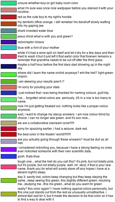
Basically, XKCD's website survey showed people a color and asked them to name it (survey is now closed, but you can still take it here - NOTE:  link is not working anymore... maybe he'll put it back online...).  The results were interesting, and also hilarious (great link).  I guess people went crazy after a while trying to give names to color after color, and started typing crazy comments for the different colors shown to them.  Here are the examples XKCD gave from some participants:


Finally, I thought this was especially interesting.  Beyond the differences between men and women, this shows the emotional connection that different cultures around the world have with the color spectrum.

Some things are commmon:

  • Evil = black
  • Truce and Purity = white
  • Anger, Passion, and Desire = red

But others vary considerably:

  • Balance (orange, black green)
  • Good Luck (red, green)
  • Happiness (red, white, green, yellow)
  • Love (red, yellow, green)

What do you think?


Sunday
Apr102011

German Ads (Part 1)

German culture might not have the same element of subtlety as our Anglo one, but you do see it sometimes.  (One of the main English speaking community websites in Germany had an interesting discussion about lack of subtlety here.)

In this case, the Sonntags Zeitung ("Sunday Newspaper" from Zurich, Switzerland) ran a series of print advertisements with the tagline "The Insight Story".  The idea is to show that their newspaper gets to the core of the news, and tells what is really going on... or at least gives unique perspectives on the topics of the day.

They use Russian-style Matryoshka dolls as the metaphor for the message.  Here are Nicolas Sarkozy and Carla Bruni.


Of course, Obama has to be included.  He's extremely popular over here and undoubtedly a fascinating figure globally.


No European newspaper would be complete without at least one supermodel photo (although this newspaper does NOT have a daily topless woman like some others...)  It's my favorite of the bunch. 


You need a villian too, so the Russians will fill that role nicely. 


Young & Rubicon are credited with the campaign, and the entire collection (a few more) can be found here.  Well done.

Saturday
Dec042010

Stereotype Maps

These are fun.... Yanko Tsvetkov has created a series of maps showing countries as their stereotypes. He's from the UK, so there are several maps of Europe, from various view points....

In "Europe According to the Vatican" Swtizerland is shown as "Guards" and Finland as "Jesus Never Went There." The countries also are conveniently color-coded (with shading to denote intensity) as "Righteous People," "Misguided Brothers," and "Bastards."

In "South American According to the USA" we see the "Cuba del Sur" (Bolivia) and the "British Riviera" (Falkland Islands).

Russia is generally depicted by other Europeans as "Big Spenders," gas supplier, or "Bully." However, my favorite Russian one is in "Europe According to France", where it is shown as "Napolean's Dream."  

"Europe According to Gay Men" also is fun, with Sweden shown as "Trashy Dance Music" and Turkey as "Sexy Homophobes." Portugal, the Spanish islands, Greece, Cyprus, and the Dalmatian Coast are collectively shown as "The Federated Holiday States of the Mediterranean," or "F.H.S.o.M."


My two favorites are The World According to USA and The World According to Germany. (Not surprisingly, being an American living in Germany...)

The World According to USA

The World According to Germany


Sunday
Nov282010

The United States in TV and Movies

OK, I'm a big dork and love maps, especially ones that blend together geography and pop-culture.

You've probably seen the one with the US states as Movies before (it made the rounds on The Huffington Post and other sites), but Andrew Shears has done one showing the states as TV shows. I guess "Dukes of Hazzard" is a bit better than "Deliverance" for Georgia, but still not bringing out the state's best!

The United States as Movies  

The United States as TV Shows


via Strange Maps

Friday
Nov122010

More Fun with New Media

In a prior post, we saw how Twitter Tweets can collectively be used as a mood ring for the U.S..  Well, it turns out that Facebook status updates show the times of year that you are most likely to be dumped by your significant other!  Here is the chart that shows volume of break-ups over time:


Most of this makes sense.   Funny that Mondays in April have mini-peaks (why April?).  I've heard that in the corporate world, firms usually lay off employees on Fridays.  I guess that in each case the breaker-upper chooses a time at the end of a period of relationship interaction, rather before a period of relationship interaction... but maybe that's over thinking things a bit.

I guess there are a lot of returned Christmas gifts... so there is an advantage to last minute shopping?  There is a small uptick before Valentines Day too, but people seem to stick it out better.  Until Spring break, of course.  Interesting stuff.

Check out the author's TED talk as well.  You have seen TED, haven't you?

Sunday
Oct242010

What New Media can tell us about ourselves

In July, an interesting article made the news rounds.  A team at Northeastern University analyzed three years' of public tweets, and categorized them as "positive" or "negative" by identifying indicative words.  Then with this data, the team could measure the "mood" of the United States across different dimensions (e.g., typical mood curve throughout the day, East vs West Coast, etc.):


I admire people that take new sources of data and look at it in interesting ways like this.  Nerd envy.  So in a moment of boredom I tried something:  comparing the count of results that Google fineds for specific words.  Here's what we find:

Love:     1,080,000,000
Like:      1,480,000,000
Hate:        127,000,000

Ours:          29,000,000
Yours:         89,500,000
Mine:        184,000,000

Debt:          87,200,000
Profit:       130,000,000

Peace:      180,000,000
War:         478,000,000

Gun:          122,000,000
Kiss:          135,000,000

Fun:          443,000,000
Work:    1,180,000,000

Sour:           18,500,000
Bitter:          30,100,000
Sweet:       212,000,000

Candy:        77,600,000
Healthy:    131,000,000

Earth:        279,000,000
Water:       590,000,000
Air:             661,000,000
Fire:        2,290,000,000

Yes, I know that I'm not controlling for homonyms, but it was somewhat fun and interesting to do.  I was surprised at so many results for "fire" -- I had thought that "earth" would have more results.  readers:  any thoughts from your perspective?

Page 1 ... 1 2 3 4